The first brief of the year, the creation of an app that addresses a problem, which, in many ways, is quite similar to a brief we had last year, but this time, it’s not just simply about the development of good UX and mediating until a proper solution can be made, but more about how well we cater to solving the problem we set out to address, which means we really need to put ourselves in the shoes of people who experience the problem… or be one of those people ourselves, but I will expand upon this as soon as I have expanded upon one of the problems we were told to “deep-dive” into. We were given the option of an immediate one-word problem, and one that touches us deeply. As soon as I have unpacked as much as I can, I will specify which one was chosen in the end.
We revisited the types of information we acquire to address problems; there is primary and secondary information which encompasses the experience of the researcher, but this can be expanded upon as there is also information that exists within a tertiary space – the space in which the problem and potential solution exists .
There are three types of tertiary info, which are dubbed to be the personas.
First Persona: The group for which the problem is being addressed. Info is collected on this group to understand both the nature and intricacies of the problem. They, in the end, utilise the solution to the problem.
Secondary Persona: People who mediate or distribute the solution to the first persona.
Third Persona: People with an invested interest in the solution.
21/01/2020
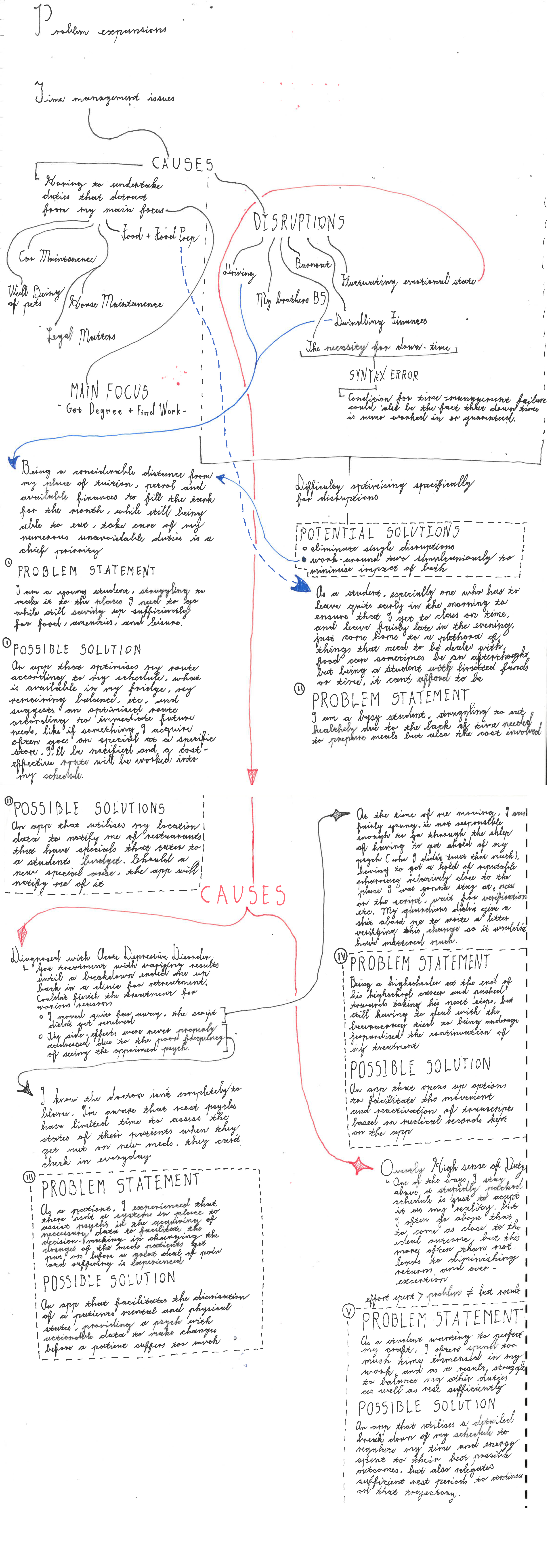
So we were tasked to get together five problem statements along with their possible solutions… in a day. Now, to have a problem statement, you need to have an understanding of a problem and the audience (first persona) that the problem plagues. One day is not enough time to execute even preliminary research on the problem, so the best I could do for now is to look within my day-to-day living and see what plagues me. Hopefully I can find problems that are large enough that they need tackling, and are broad enough to an entire audience, making it worthwhile to tackle. I’ll get back to you all once I have effectively and simply, mapped out my life, literally.
21/01/2020 Part 2
Okay, I have finally mapped everything out in condensed format (still takes up 2 A3). My problems are pieced out, and I think I got some interesting ones worth the time and effort to make an app about, I’ll display my process as soon as I get a chance to scan the shit.
22/01/2020
22/01/2020 Part 2
Consult is done, potential problem statements #3 and #4 were the ones best-received, and should almost make a hybrid that is capable of addressing both the needs that both groups experience as being unmet. Problem statements #1 and #2 had issues concerning the nature of convenience. With #1, it becomes an issue of how deals are distributed among competitors and when they are available (which is something that the company controls for their benefit)
23/01/2020
Okay, so I’ve looked at my schedule trying to get a jump on the workload, but truth be told, I got no idea on a step-forward. I know that we’re gonna be using in.vision studio and sketch so I tried to at least access it, but it needs login details so that’s gonna have to wait. What I can do is grab some ideas for ui/ux, seeing that I’m a bit rusty on whats good and trendy, so I’ve been checking trends and found this
https://uxdesign.cc/8-ui-ux-design-trends-for-2020-68e37b0278f6
Definitely worth a look, but to condense it down it a bit, the things trending right now according to the website, is as follows:
note: This isn’t all of it, there’s more. These are the ones most relevant to my potential problem statements.

An app isn’t solely about function, animated illustrations bring quirks that make apps appear to have a degree of life in themselves


Micro-interactions are the apps way of reciprocating the energy that comes from your interaction by giving you an animated response indicating what it is you did, without which, apps can feel quite janky.

3D graphics are extremely useful for infomatics where 2D just wont cover it like with schematics.
Its more well known as skuemorphism, a style that invokes the idea of an illusion being given weight and depth properties and sub-properties of those aformentioned properties, like shadows, variable lighting and highlights. In terms of animation and micro-interactions, its also about the travel of the simulated buttons and the sliders (delay and smoothness)
30/01/20
So we’ve just been through our presentations of our concepts, some were well received, others not, but either way, we are almost at the end-of-the-woods of the DEFINE stage, let me clarify.

To give some context, we’ve been through the EMPATHIZE stage, which lead us to a very broad-spectrum problem, In my case it was growing issue of medicinal non-adherence (when someone doesn’t follow their script as advised for whatever reason, and there could be a plethora of reasons and not just one at a time). So my next step was to find stats concerning reasons why someone would suddenly stop using their script.
What I found was that one of the major contributing factors for the reasons for quitting is different dependant on the issue that the meds themselves address, for instance someone who was put on a script to deal with TB, the side-effects don’t compare to having the disease so the likelihood that they would quit because of side-effects is low, in fact the likelihood that they feel better before their script ends is quite high, so the chances that they quit using the script because they feel better is high.
Of course, the meds themselves can vary as much as the problem itself, so here’s where the DEFINING stage started for me. Who is the audience/who specifically are suffering from the problem? Who do I target? Looking retroactively at my own experiences, I understand the reasons why someone who suffers from a mental illness would stop using the meds. They could be suffering from fairly intense side-effects, they could be so tied to what they do and their priorities that their wellbeing gets put on the back-burner, they could be traveling and are out of reach of their trusted health advisors and a way to equip them with the necessary meds, they could be too drained to put in the effort to go through the complexities to renew the script, or there is a barrier to proper communication between the psych and the patient, which results in the breakdown of trust.
Which of these can I address? Obviously there is no way for me to affect the moods of people in such a manner that it makes them want to take their meds, (you cant forcibly change an attitude in any way because humans aren’t wired to be that way), I can’t change the weight of a person’s schedule so that their wellbeing becomes the forefront of their focus. I can’t take away side-effects, and I certainly don’t have the knowledge to give patients advice to address the issue. What I can address is putting a bridge down that makes renewal of script easier in some way. Now its all about figuring out the how.
01/02/20
System Design Guidelines
So, the designing of systems and how those systems are interacted with has been a art/science (depending on which side of the coin you are looking at it from) in and of itself for a long time, so much so that individual companies have made it top priority to make design systems that exclusively fit their philosophy, mission, products, etc etc, in hopes that what they offer is both unique and suits its purpose. This equally applicable to companies whose intellectual property consists of operating systems and the frameworks that make them.
For tech-giant Google and their OS (Android), they have Design for Android, (a very unassuming title for a guideline framework, I passed it several times thinking they would, with their track-record of naming OS versions after sugar-laced treats, at least have given the guideline framework a cooler name, I suppose they did it for developers’ sake and not users) which includes their framework for the design-aspect of apps, which is named (far better than Design for Android imo) Material.io. The guide outlines text-usage, how to give apps a material-based design, potential ways to go about color schemes, icon development and consistency suggestions (they give quite a bit of scope for experimentation compared to Apple’s iOS).
03/02/20
For iOS, Apple has developed the Human Interface Guidelines which do virtually the same as Design for Android, but have a more comprehensive guide of rules to follow with regards to being in line with their operating system design principles, what they have to their credit however is X-Code, which has a comprehensive library of their most common objects, buttons, sliders, etc, meaning that you don’t have to design everything on your own, you can substitute accordingly.
03/02/20 Part 2
So we have been given a green-light to start considering things like User-Flow and give a hard-pass to the initial wireframing (which can be very tedious, so I’m half grateful), which is all well and good, but what the heck is user-flow?
User Flow is the projected pathway that a user takes through (but is not limited to) an app to achieve a goal or intended outcome. It can be linear, non-linear, circular (if there is no singular end-goal), you name it. The purpose for mapping this out is not only to get a sense how easy a process is (which is basically what an app is – nothing more than a facilitated process to access a function) and streamline accordingly, but its also a great way to anticipate and visualise dead-ends in certain scenarios and add bridges so that the user can, in the end, “complete their journey” so to speak. You remember when I said that I’m only half-grateful for skipping the wire-framing process, well, finding and subsequently visualising a dead-end is quite challenging because you are now, at that moment, solely reliant on your fallible human logic to complete the track that your “currently imaginary” user is on. Even with the aid of a completed wire-frame, it is completely possible to find that your last “what if” scenario is followed by an “oh shit” declaration. Unfortunately there is no tool yet developed that can assist with finding errors in human train-of-thought, so this part of the project has to be done the very, very, very old fashioned way (and if you didn’t get the need for me to articulate the word very three times, I mean old, as in cave-men developed this and it didn’t progress from there)… which takes time. So I apologize for it taking so long, but here it is

06/02/20
Getting stuck into Design
My apologies for the late response, its been quite hectic the last few days, but I suppose its in the best ways possible because now, its all centered around design.
We are legit in true green-light territory now, just a hop and a skip away from prototyping. The design presentation went better than expected, (despite losing 2 completed screens, rife with design considerations and iterations for buttons, potential text spaces, etc to Eskom… the bastards)
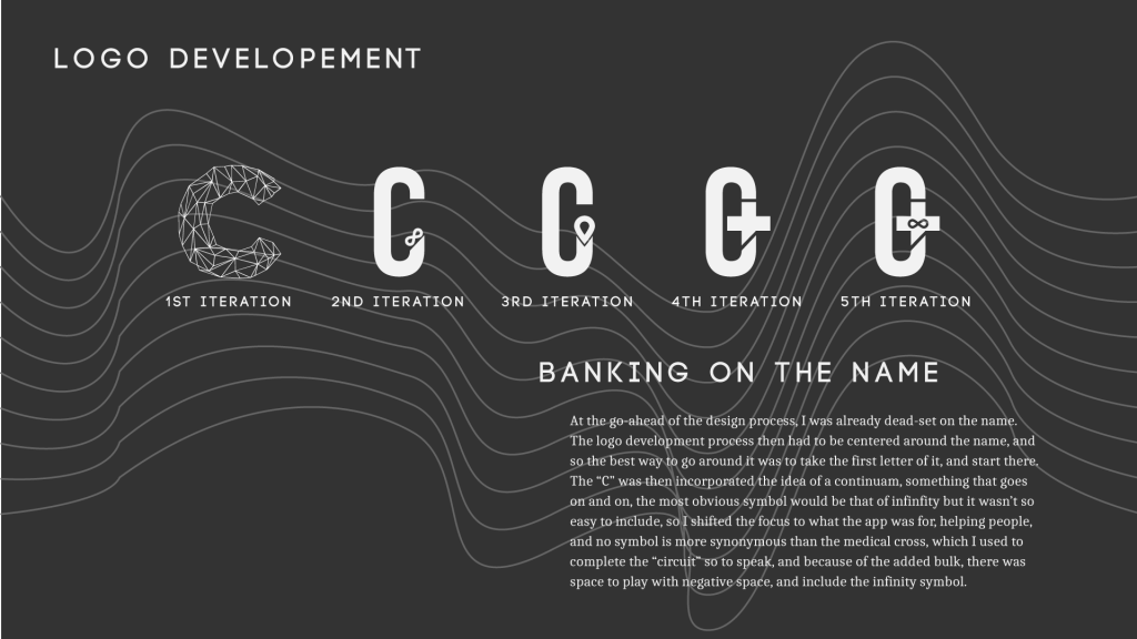
I got a fair amount of constructive criticism for the look and feel, I basically need to re-assess how I want to tackle user interactions (and potentially come up with ways that bypass the need for buttons), my logo needs work, I need to go through more literal associations to the medical field, like RX, the symbol often used to represent the pharmacies, or the pill.
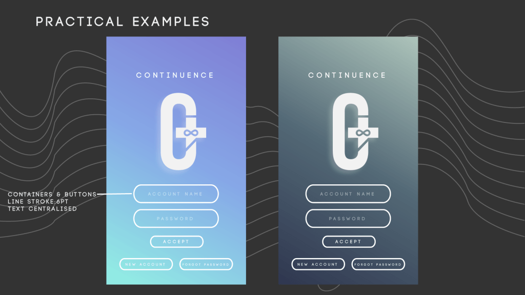
The color scheme is half accepted, the one on the right, not the left. That too needs some work, but I’ll get on it.
15/02/2020
Hey, sorry its been so long since my last post, on the days where I wasn’t busy, both with the app and some personal business, I had no connection to the internet. Thankfully, a friend of mine was willing to let me borrow his travel-modem for a couple of days, I just need to repay him a portion of the cash for the data I use, with that in mind, I’m gonna be compressing as much as I can in one go so that I don’t have to pay back a fortune.
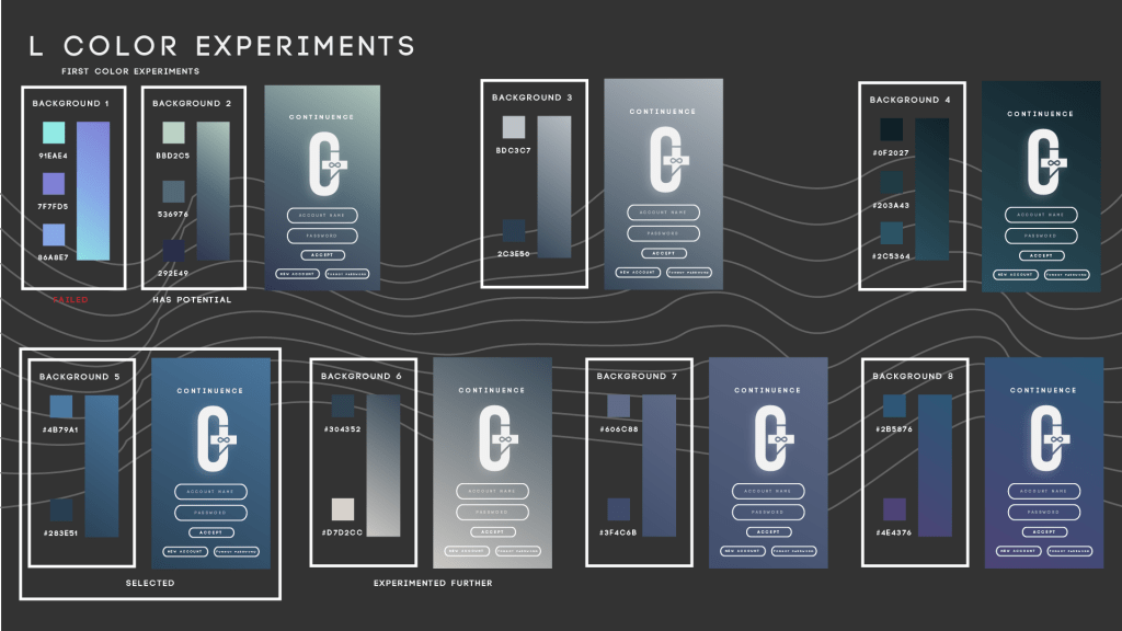
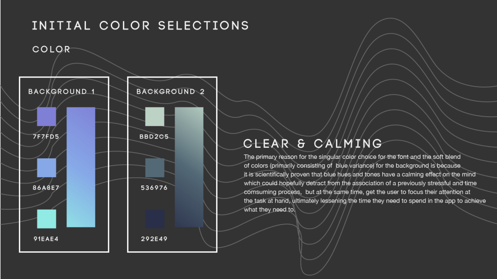
As mentioned above, the previous color schemes didn’t quite work out and because I wanted it to be so consistent across the board, I needed to experiment more. In the end I settled with the first one at the bottom of the above picture, with the deep blues (which are known to have a calming effect on people), and because I have a doctors section, I had to choose another one. The one right next to it, after a bit of directional editing, I chose it for the doctors section
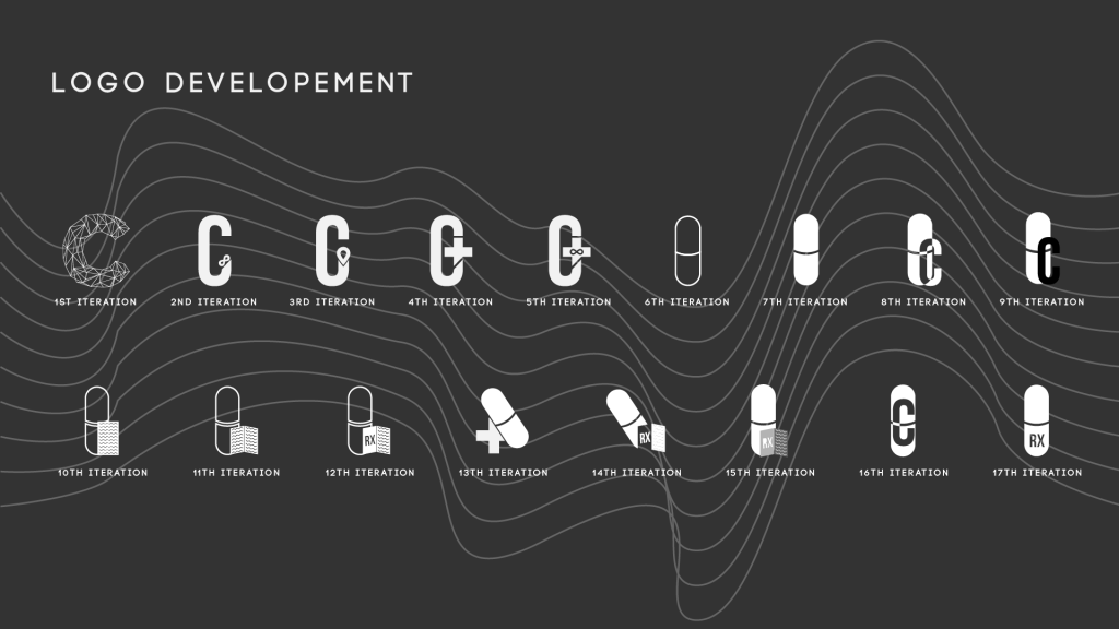
The last set of logo’s weren’t as approved as I would’ve hoped, so I revisited them and looked at other iconography associated with the medical fields, like the pill, the rx, I found a bit more info on it, it apparently comes from the Latin word “recipere” which meant a corrective course of action, its where we get the idea for a recipe, which harkens back to the days where apothecaries (precursors to practitioners of medicine) would inscribe a formula of herbs, spices, and other ingredients (as opposed to modern day drugs which have all the necessary ingredients in one pill) to patients so that they could get better.
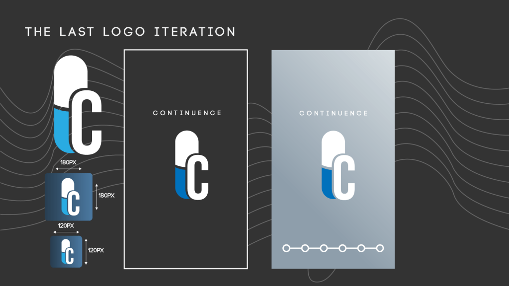
Continuing that train of thought, what about the modern day pill? Aside from its obvious representative connection to the field of medicine and getting well, it has incredible symmetry and can be illustrated simply, So I experimented with further with the pill idea, 11 iterations but none of them really stuck. With a little help on my 9th iteration, I got to make some changes, and this is what I have now and have stuck with. It’s clean and simple, which suits the overall style.
15/02/2020 II
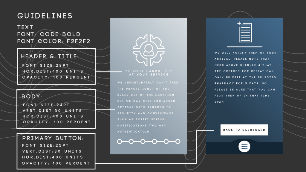
So we had a relatively short window of time to develop the guidelines for our app, but I finally got through it. I utilised only one font for the entire app, just with subtle alterations the kerning, font size, vertical distribution, opacity, etc, etc.
16/02/2020
A lot has happened over the last few days. A bomb dropped 3 days before deadline, with a particular requisite of the brief put us all into stress mode, a requirement of a full user flow illustrated, meaning that there would be at least 40 screens to show and annotate, thankfully the user-flow I made was so comprehensive, I knew exactly what I needed to make in terms of screens for the patient section (not exactly true of the doctors section, wasn’t exactly expecting that I would need to make a section for a practitioner but in retrospection, there would be no emergency function within the app if I didn’t. In total, I have 62 screens, of course, it didn’t help that I misunderstood one of the requirements of having a prototype of one of the primary functions (I understood it as having a full prototype, all 62 screens, really added to my stress levels, was quite the punch to the nethers to hear that wasn’t the case). All in all, the presentation went okay, I got solid (and actionable) feedback on what to fix, which is really nice for a change. Quite a few things will have to be put on the backburner for now, what I can definitely do is the annotation section, and start considerations for better animations.
18/02/2020 Final Post Until Revision for Event 3
So, it took considerably longer to do the annotations than anticipated (they are done, all 62 screens and videos, but man did I not expect that it would take so long). Of course, it limited time to consider custom animations, but in a way, I am happy to leave it off at this point, seeing as I have no knowledge on how to incorporate them with the prototyping software as of yet, but I will get there. There were a few limitations with the presentation software that I use (Libra – its free and luckily doesn’t require internet, but it has downsides), which resulted in video files not playing on the presentation file, so I left it to this morning, added them in with PowerPoint on the Macs, just to make sure they work and aren’t corrupted files.
Introspection: We did something unusual this last Friday (date of the final presentation: 14/02/2020). We had a time of reflection on the brief as a whole. Why is this odd? Well, I don’t really have time to reflect, or at least I don’t give myself the time to, which I think is gonna be a thing for a lot of new processes for all briefs from here on out. One of my colleagues has apparently been doing this all along, and according to our lecturer, there is some merit in doing so, perhaps not in terms of leaps and strides in physical productivity or increase in skill, but perhaps in mindset, something that helps him to see the growth in the progress made, so perhaps its not a waste of time, so I will give it a shot
What do I think of this brief: It was difficult, with a new software package (In.Vision Studio) to learn but also a new theoretical element to include (personas and user-flow as opposed to actual prototyped screens). We spent two whole weeks in the defining stage of the development process. I’m not used to spending so much time thinking of things, which taxes the mind quite a bit.
Did I learn: undoubtedly, so the process wasn’t a waste. It may not be what I want to spend the next few years doing, but that is something to be decided later, the year is still young.
