
20/02/2020
We will be taking on a client brief, Freedom of Movement. They are a bespoke leather-works retail store, aiming towards the more premium market. In collaboration with the Photography department of the Academy, we will be making social-media advertising material for the company to distribute as they see fit.
Apparently, by this point, we’re already supposed to have some sort of breakdown of the brand identity, but thats a bit difficult to do when there is a literal warning against the copying & redistribution of the source material given to us (under the confines of a copyright & confidentiality waver), I get back to this once I have some idea of what I can and cannot do.
20/02/2020 II
For class, we got a pretty sick refresher class on Cinema 4D, but explored more into the necessity of a high sub-division count, lighting and material properties, and how the preparation of those three qualities (in the right amounts) can make something appear to be so much more realistic in stead of something that looks a lot more like play-dough. Here’s what we made during that lesson.
23/02/2020
So, we’ve done another software exercise in Cinema 4D, obviously, stuff didn’t want to work for me (typically) during pre-render, so I’ve got nothing to show for it, but it doesn’t matter, cause at the end of the day, it’s all about the brief, so I’m not gonna bother, but its not like I could anyways until I got Cinema 4D and the updated Adobe Creative Suite, which was today.
I have extensively gone through the clients guidelines. Upon analysis, they make use of three particular sans-serif fonts (won’t disclose the names in case it violates the contractual agreement with the client in terms of their copyright), one for their primary brand identity, and two others for web and print headings and sub-headings. Those three fonts pair up with three colors, a shade of black, a shade of white, and a green (won’t disclose the color values for the above mentioned disclosure agreement). According to their key pitch, they identify themselves as a proudly South African brand that is recognised across the world over. Their aim is to inspire others to forge their own paths and futures. They want others to have the “freedom” to “explore, dream, and create.” Personally, I feel that their key-pitch conflicts with their “bespoke” style (as you will see by my analysis of their website), but it may be a good thing, because their minimalist visual representation of their brand is clear, but also in a way, bland. This could give a bit of scope to justify a bit of creative flair.
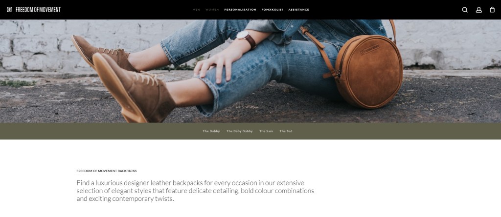
Upon inspection of their website, the overall appearance of their website is very minimalist in style. The logo is stripped of any unnecessary artifice (like the circle and inner text, which is apparently a new development and is what they going for now), and just has the crown and brand name. The buttons and hovers are simple and don’t do any fancy animations, just a simple glow & grow. The search, account, and shop buttons, when clicked, perform a slide to their respective pages, the items are arranged in a grid pattern which is pretty standard for most online shops.
Overall, it’s very clean, which is probably what they attribute to be their “bespoke” quality, like the products themselves need minimal introduction, they speak for themselves. This makes it a bit challenging. What do you do to the materials given to you if this is the quality they want to portray? I took a further look at some of their Instagram to see if their is more scope to this.
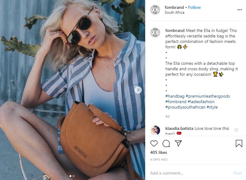
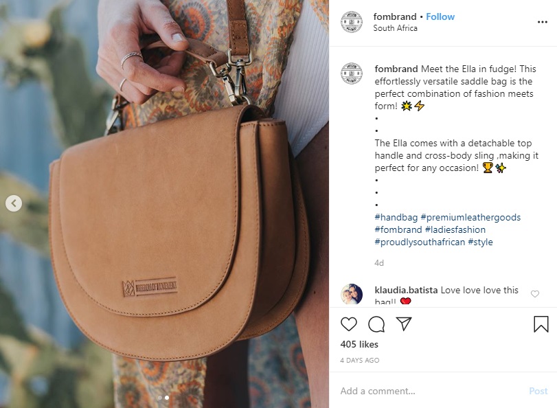
The above images are very reminiscent of lifestyle brand pack-shots. I wouldn’t say that they necessarily embody their key pitch, but it is a female-orientated product on display.
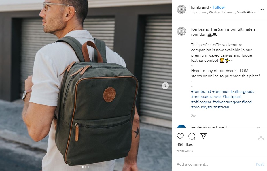
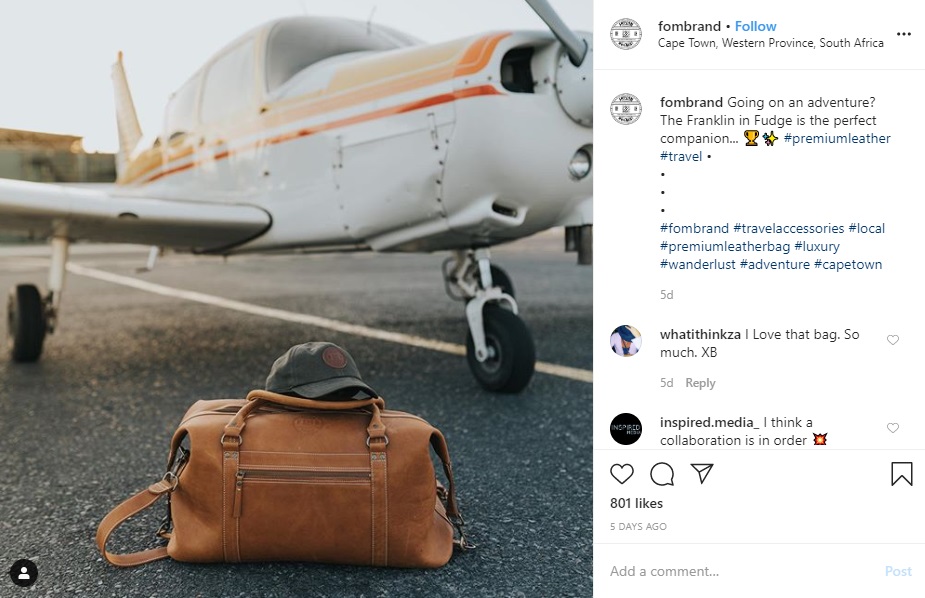
These two images demonstrate that their products are more orientated towards the “traveling soul.” There is a denotation of being for an above average market.
What do I know so far: They aim for being practical but bespoke (premium) at the same time. I know their guides, and as a result, how to make use of their fonts and colors. What I need now is a style to go for.
25/02/2020
So it’s been a rough couple of days, I’ve been working on my car to get it through the road-worthy test (If it isn’t passed within the next week and a half, I will be without a vehicle, most likely for the remainder of this year) so that it can finally be put on my name. I took it through to the DAKRA testing center, after a day of waiting, I got a shortlist of things I need to fix before I take it back to them for a last check and approval. It’s been eating my time and money (two things I have virtually nothing of), and I can’t wait for this nightmare to end. Hopefully by the end of it, I can properly put my focus to this brief.
25/02/2020 II
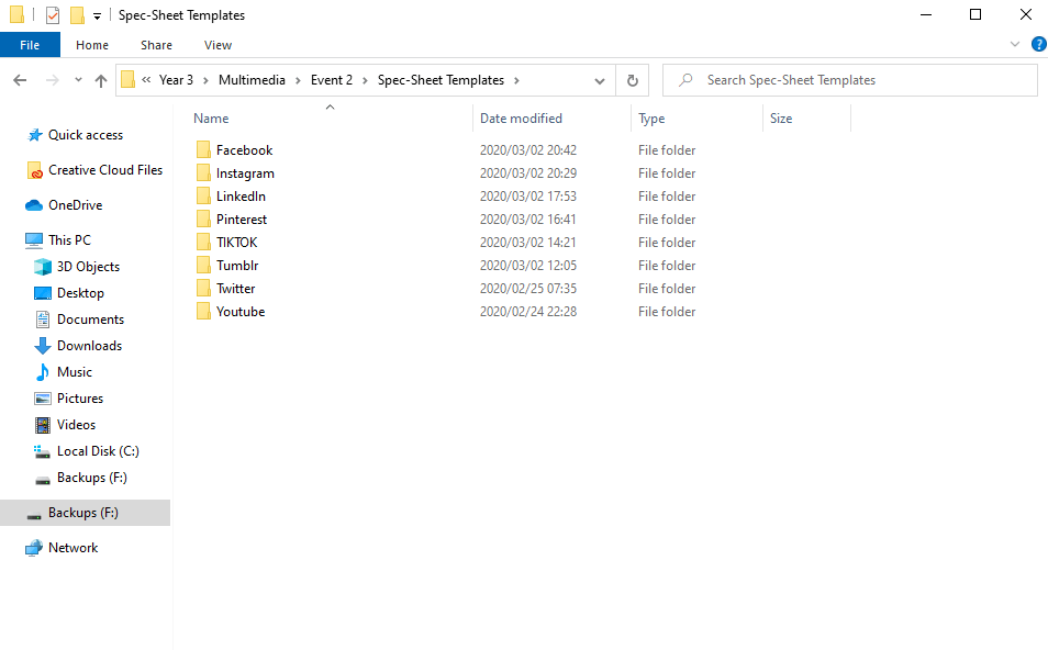
With virtually no data in hand, what I have been keeping myself busy with is prepping file templates so that as soon as I got an idea of what I’m gonna be doing, I can just get stuck in.
The rest will be made this afternoon, seeing as the workshop isn’t open today.
01/03/2020
My sincerest apologies about not writing sooner, it’s been a pretty heavy couple of days, my pc has been busted for the last couple of days, which put me in full panic mode. Over the course of the last couple of days, a friend of mine and I have tried everything to fix it, going all the way down to doing a full system strip, even that didn’t do much. So we took apart the tower, cleaned it out, did a physical strip and reset of the components. In the end, resetting one of the watch batteries that acts as a semi-conductor did the trick. Downside of going down this far; I lost all of my files (all my Academy stuff is backed up, so that’s not an issue) and software, its gonna take some time to get it all back. On the up-end, Wessel was kind enough to let me borrow his internet to get the most important software like the Adobe programs. If ur reading this dude, I seriously owe you one.
02/03/2020
The full spec-sheet is finally done, or rather, as much as they need to be. We got clarification that we only have to cover a single post-type per social media platform. I selected the ones that are most likely to gain the most traction in terms of attention (aka, how much real-estate they take up on a screen, how animated they can be, etc), but also how much fun I can have with the medium, after all, social media content creation is grunt work, no two-ways about it.
It’s a fact that there is limited scope for creativity for an already established brand, and we got news that some of the content created by our photography department was no so well received by the representative of FOM, so we may have to be the balancing factor in this professional/client-relationship equation, which, I’m not gonna lie, has me a bit nervous. What was meant to be a fairly straight forward brief might be a lot more complicated now.
03/03/2020
Color Generation
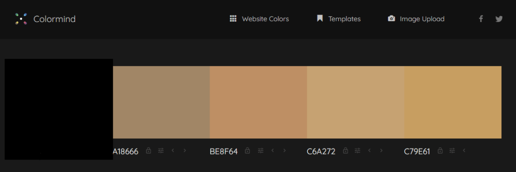
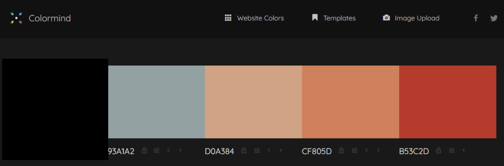
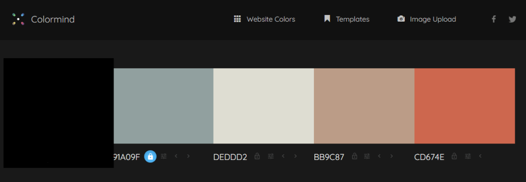
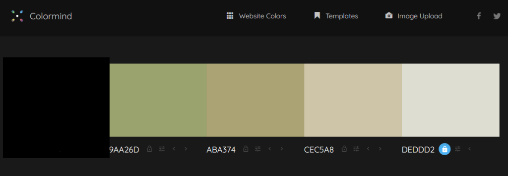
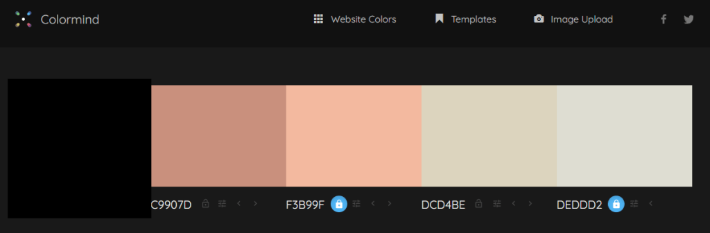
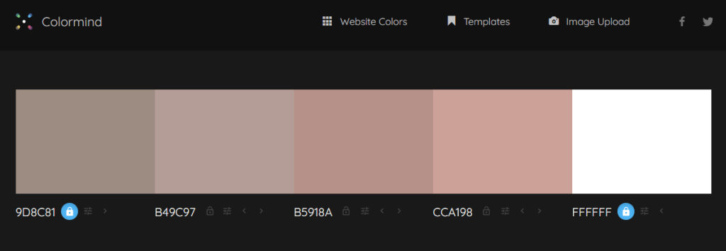
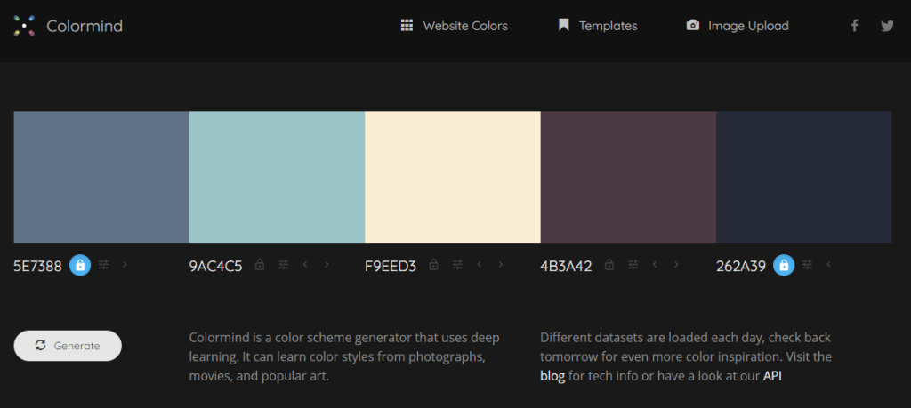
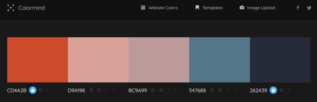
According to the brand guidelines, there is a fairly limited color scheme. Because we are doing this for each of the 8 major social media platforms currently standing, there has to be 8 different schemes adapted to each platform. If I were to sample one of the main colors from the guidelines and compare them to more versatile color schemes, my eyes would be glued to a screen for days. To get around this issue, I utilised Colormind.io to directly sample one of the main colors, and use the algorithm to generate complimentary colors adjacent to the starting color. Of course, in respect to the confidentiality & copyright waver, I blocked out the starting color and its hex-values
03/03/2020 II
Media Research
We are being given a ton of material to work with, but with very little guidance on how it should be used. To my knowledge, there is a ton of photography material, some video, maybe some full 3D scanned OBJ’s (wishful thinking, I know there isn’t), etc. How does one take it and express it in creative ways? One way is how it is edited in its relegated format, the other is through expressing it into other media types that have different qualities and features.
Animated Photo-Comps:
Photo-comps (also known by their full naming convention as photo-compositions) are compositions that combine elements from other separate, self-standing photographic elements (can also be illustrations and other graphic forms) into one composition, often with basic animations tied to each element.
Cinemagraphs:
According to Flixel, cinemagraphs are hybrids between the photographic and video mediums. There are elements that are animated while other parts remain completely stationary (like the background or the subject). “They contain subtle motion that plays in a short, never-ending loop, while the rest of the image remains still. The motion highlights a few seconds from the video, blending it seamlessly into the still photo.”
After Effects
It should come as no surprise that the grand majority of material that we will be working with can be edited via After Effects, and as such, we were told to do some research regarding some of the tools within the software.
Repeater
The repeater is a tool that generates copies of a selected shape or mask along the X,Y – and sometimes with a bit of toying around – Z axis. You can set the distribution and movement of those copies along those axis’, but it can also be randomised, and every single one of those parameters are animatable.
Track Mattes
Track Mattes are essentially shapes, masks, videos, etc, that are used to generate variable transparency in other items.
03/03/2020 III
So, it’s no secret that I’ve been stressing about how I can possibly execute an idea that is captivating without going out of the bounds of the brand identity that they have already established. Currently I don’t have the tools, resources, and time to do it in their style. According to Wessie, that’s ultimately not the goal of this brief. The goal is to provide material that is in line with the parameters of various social media platforms, and to show off our motion-design skills as best as we possibly can. In other words, at the end of the day, we are not being penalised by breaking the mold, which is a great relief.
03/03/2020 IV
Ideas
We now have an idea for the scale to which we should aim for, as well as a guideline to achieving a deliverable in every possible social media platform. It was advised that we create a comprehensive motion-graphic for one platform, and then utilise its components as standalone graphics for the same campaign in another platform (with maybe a modified color scheme).
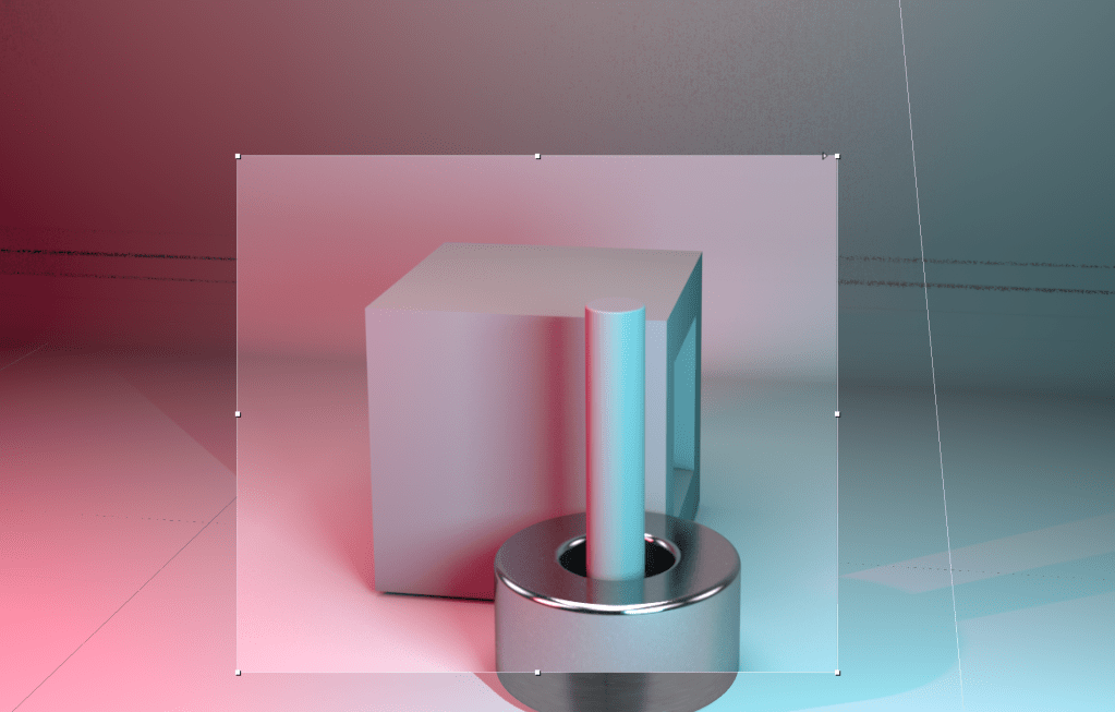
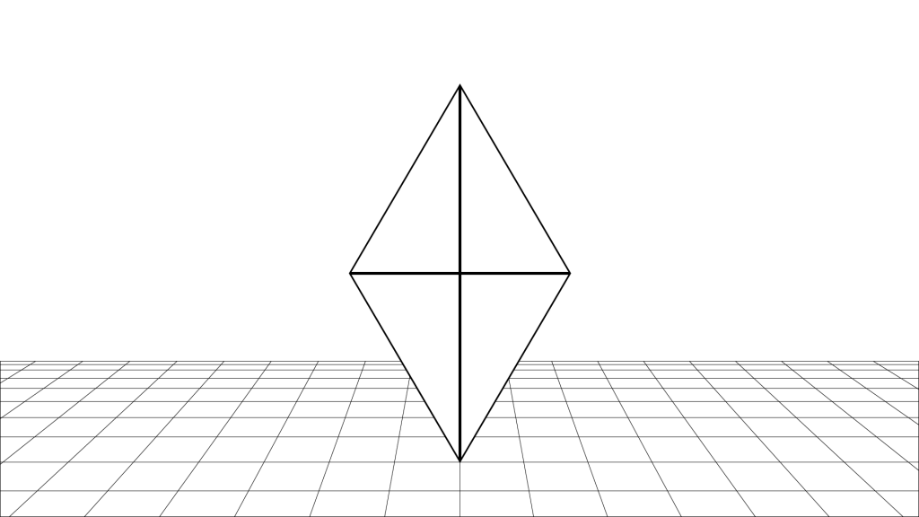
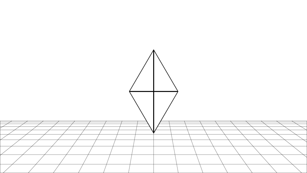
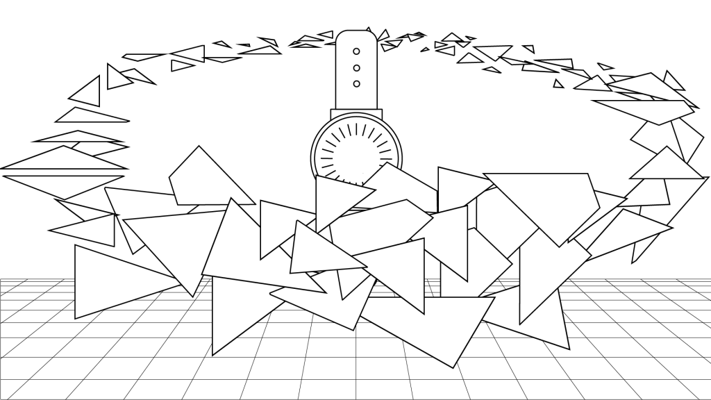
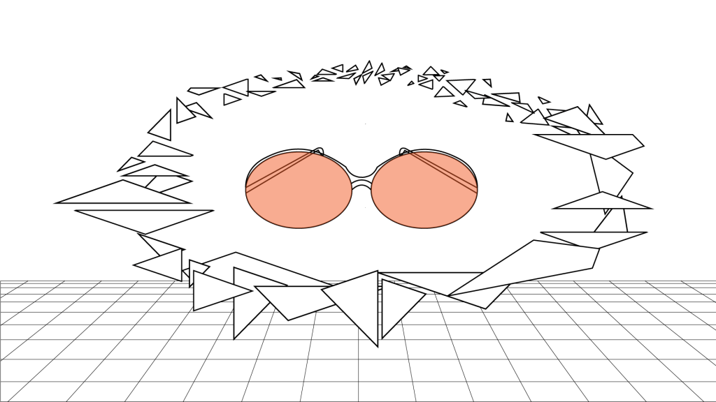
This gives me an idea. According to the deliverables giving by the Photography department, there are just 4 main categories to the products that Freedom of Movement makes. Bags, Shoes, Sunglasses, and Watches. A full suit. Now, this is probably in bad taste, but what if I associated each of those categories with a suit from a deck of cards (it doesn’t necessarily need to be those symbols, it’s just the simplest shapes to form); hearts, clubs, spades, and diamonds ? Created an OBJ for each, incased the corresponding type of items within that OBJ, and using Voronoi fracturing, reveal what is within? I’m currently working on the logistics of the idea, and will expand upon them tomorrow with a storyboard explaining how it will be differentiated for each platform, but to give you an idea if I can actually do it, here’s a link to one of my works in second-year.
In the above video, I utilised the displaced bits and pieces of a pre-fractured shape (a sphere) to create a labyrinth along the z-axis. I then panned a 3D camera through those spaces, animating a camera-attached null to give an even flow through the space, then dragging those pieces back. I tied the displacement of each fracture, to soundkeys turned into keyframes to animate on the beat. In this future motion-graphic, I will sort of be doing the reverse, I will need to create the suit, pre-fracture it, place the item within the same space as the OBJ (which should be fine, seeing as we only have flat materials), and then animate a force to enact on that OBJ to displace its fractured pieces.
04/03/2020
Story-Board
I created my story-board in illustrator to save time, please take note that the order follows from top to bottom within this blog post.
1: The Symbol of the suit floats gently as the camera zooms out slowly. (note: the floor is purely to give readers a sense of position in space. There likely won’t be a simulated floor in the animation).
2. The camera comes to a gentle stop, giving a wide view of the symbol in its space.Estimated time of playback: 1 second and a half.
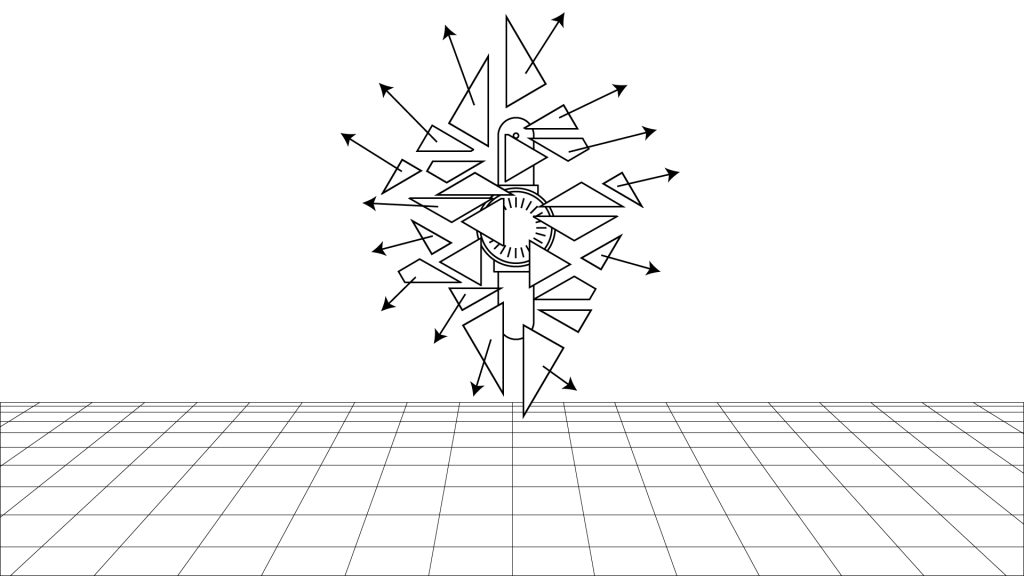
3: The symbol shatters in all directions, revealing the object inside, the camera gives jolts back a bit more as if to compensate for being in the blast range.
4: The shattered debris begins to disperse in a spherical shape and begins to rotate around the object and its Z-axis. Estimated time of playback: 2 seconds. This is ideal because if the user is not gripped within the first 4 seconds of playback, they will scroll past the content.
5: The debris distribute in a more spherical manner, also increasing its radius.
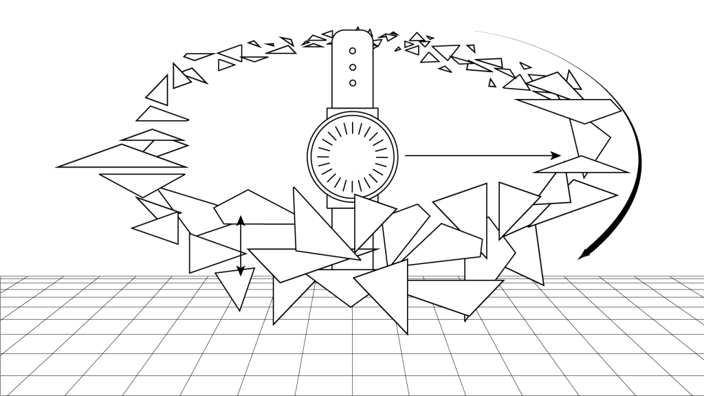
6: The rate of spin begins to increase as the debris starts to align more to the X-axis. Estimated time of playback: 2 seconds.
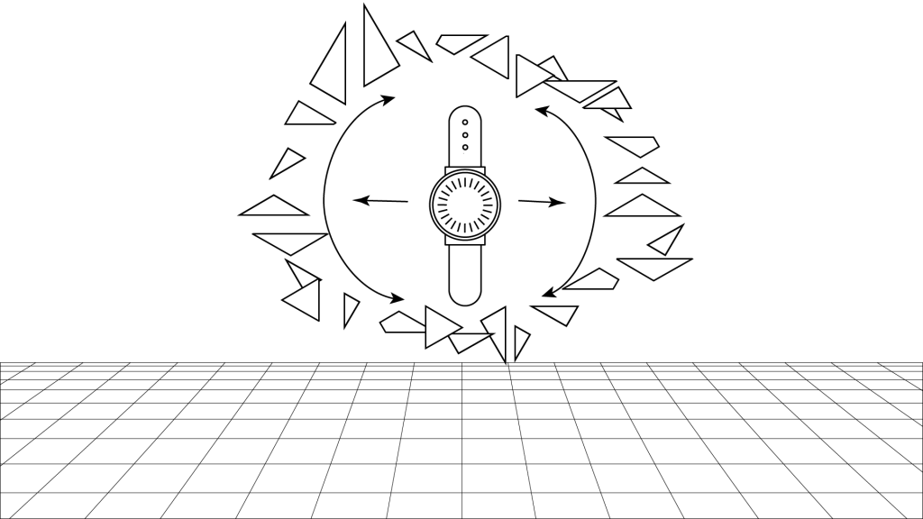
7: The arc of the spinning debris starts to widen, slowly obstructing more of the cameras view of the watch (this is done on purpose, you will see why in a bit).
8. The arc will widen to the point of full obstructing the view of the object, using some cleaver masking, I will completely remove the object from scene.Estimated time of playback: 2 seconds.
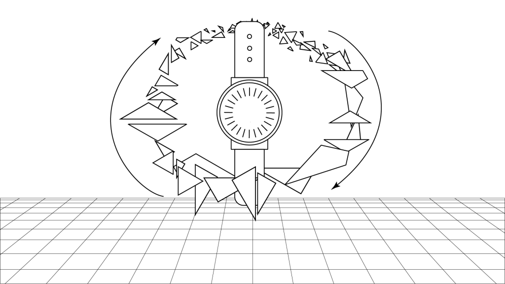
9, As the Object is swiped away, by the mask, the new object will come into view as soon as the debris makes its last pass away from the camera.
10: The new object in view. Estimated time of playback: 1 second.
The idea behind this is that I can very easily change the properties of the environment (colors & lighting) and perhaps also the materials in one comp to generate a myriad of combinations of their content in the mix in a fairly short space of time, which is currently of the utmost importance seeing as there is only about 7 days left to do it all. More over, the intro and switching can be sped up to 3X to accomodate more stuff.
06/03/2020
Process & Execution
So I have been focused on creating the suits ready to bring into AFX, but rather than solely making them in Cinema 4D (which is a time-intensive process if you don’t quite know what you’re doing), I created path lines in Illustrator…
I then took them into individual Illustrator files, and then converted them into legacy versions (Illustrator 8) of the original file so that Cinema 4D can recognise it.
07/03/2020
Sorry it took so long to upload part 3 of how I OBJ’d my illustrator paths, Premiere Pro at the academy is acting funny, wouldn’t allow me to import my .mov files into the program, I tried finding a free converter but all the free ones water-mark on the converted file and the online ones can only handle 100mb files, which I could reduce if Premiere would take .mov files to start with (insert “facepalm for irony” here). Anyway, here it is.
Using the legacy version of the Illustrator file, I merged it into the C4D comp, which churns out a very basic spline, I then use the Extrude function to give the spline some extra workable geometry. I then bake the file so I can start inner-extruding the flats so that I can create decent looking bevels.
08/03/20
Last step in object creation, breaking it into tiny pieces (I’ll explain). Cinema 4D has this amazing function called the Voronoi Fracture, which uses an algorithm to create simulated organic and uneven fractures in hard surfaces. The result is that of what glass looks likes when its broken, but all the pieces are left in their respective places until it is acted upon by a simulated force. Using this in Cinema 4D is brilliant if you don’t mind not having control how the pieces behave when a simulated real-world force acts upon it (like gravity), but this is exactly what I want to avoid. I don’t have control of the debris in Cinema 4D, but in After Effects, I do. More to come in a bit, including an example of how I exported the file for use in AFX with the Voronoi Fracture attached.
08/03/20 II
I got advice to try and stick within the theme/style of the client’s brand by using textures that are the same as what is on their products. They work with leather and suede, which has an amazingly tactile look to it, just seeing it gives a person an idea of exactly how its gonna feel. I thought it was a great idea, or it would be if it didn’t cost money to get decent textures, complete with bump maps, occlusion maps, etc etc. After two days of searching (even across more shady, back-alley online hosts), I only came across low quality versions without bump maps, which sucks, BIG TIME. What I did find, is a tool, that can help me make some.
Materialise is an amazing tool. It allows you to create the various texture files from images. Best part is, it’s free, so I thought I’d give it a try. If anyone else wants it, check out this website: http://boundingboxsoftware.com/materialize/
Be advised: Materialize only exists for the pc master race 😉
The ui is fairly easy to work, you select the O (which stands for open) underneath the height map section. Select your picture that you want to turn into texture files (the bigger the scale, the better. The largest I could find of a material I wanted was 512 x 512 which is absolutely terrribe, you’ll see why in a bit).
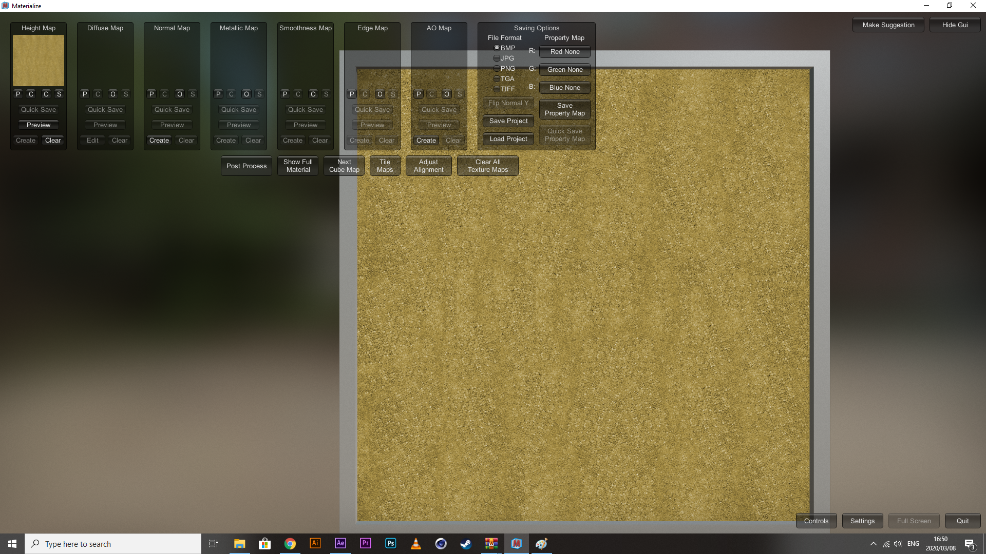
Then you hit the P (which stands for place – it takes the previous file and copies it for use and editing in the following section). Make the necessary changes to the diffuse settings and save it as your diffuse map (if you need just the individual files, you can hit the S on the respective maps to save just those files to your local disk).
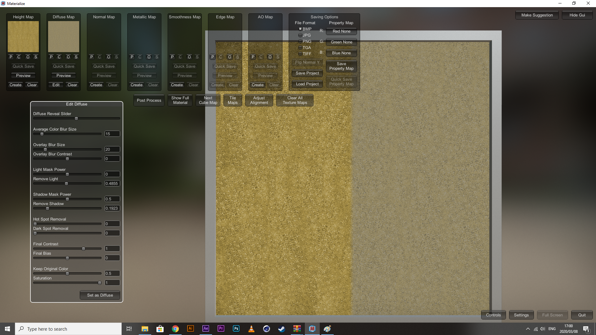
Next, you move onto your normal map. If you don’t know what a normal map is, it’s a variant of bump maps (they create simulated texture) but how they are processed is a bit different, I don’t quite know all the in’s and out’s, but in most cases, they are interchangeable. I don’t have one, I need one though if I am to make them look somewhat realistic. Hit the Create button within the Normal Map section and it will create something like what you see below.
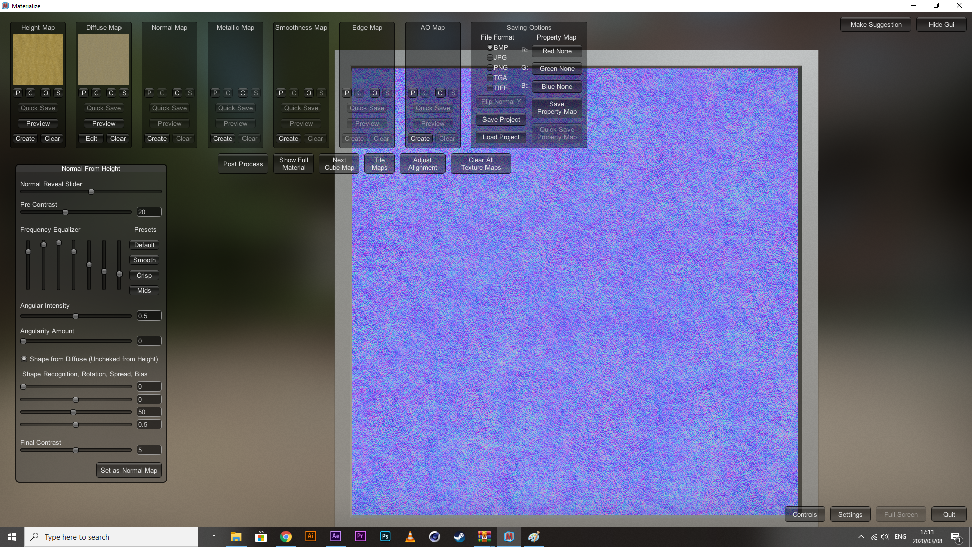
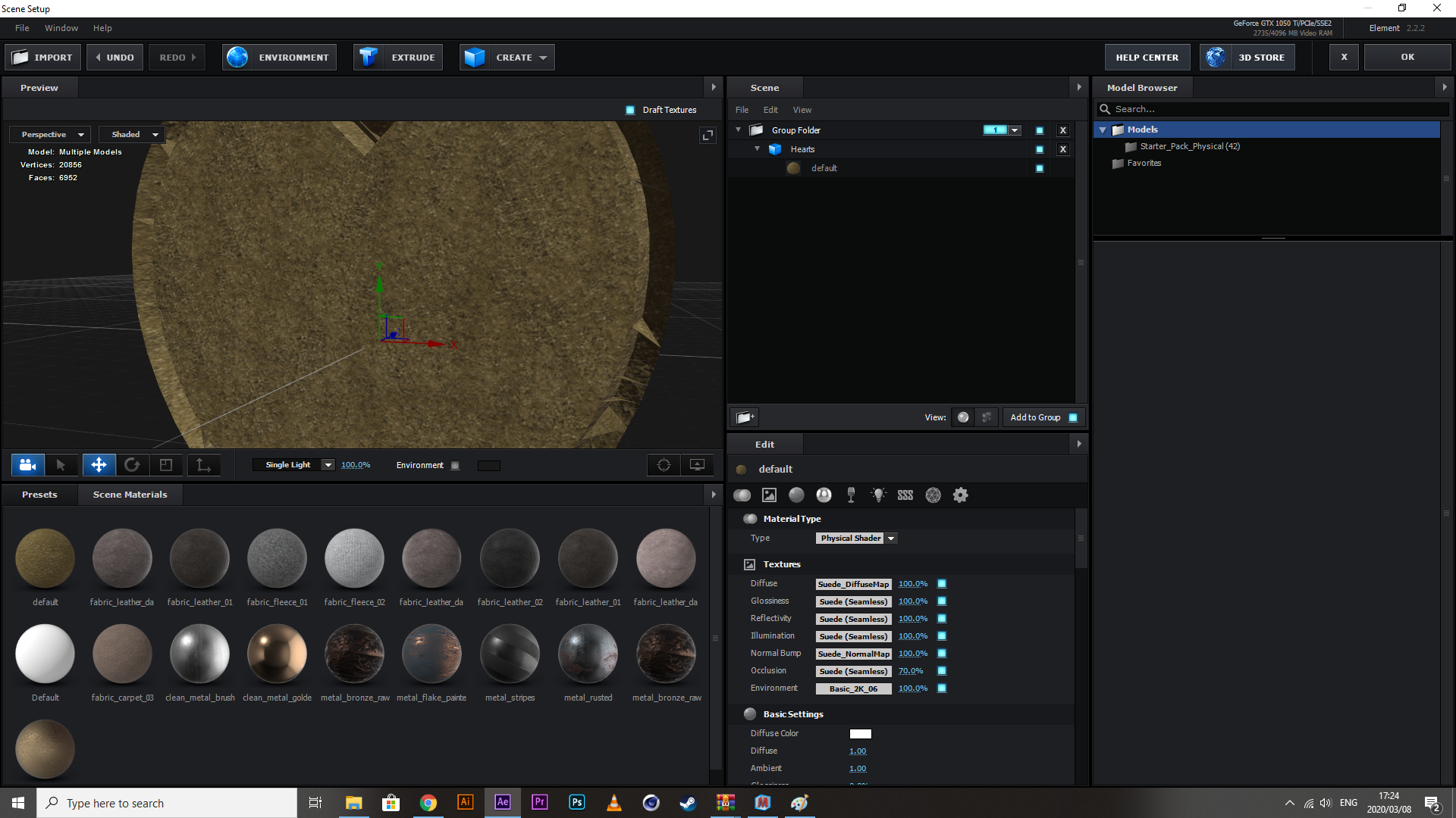
This is a normal map. Making changes to the settings here will determine how exaggerated the dips and peaks of each crevice in the texture will appear. Toning it down will make it smoother, kicking it up generally makes it rougher. Because I am working with a texture that only absorbs light and doesn’t reflect it back really, these three maps are the only ones I need, so I exported them. Down below is what it looks like in After Effects loaded onto one of the objects I’m gonna be using.
I’m not gonna lie, I don’t like the end result. The tool works but my base file is just too low quality to work with, and I don’t have a hell of a lot of time to experiment with making textures. I think I’m gonna use a ready-made metallic (I got a few good ones) and modify them a bit, at least then I can get some interesting lighting effects going.
09/03/2020
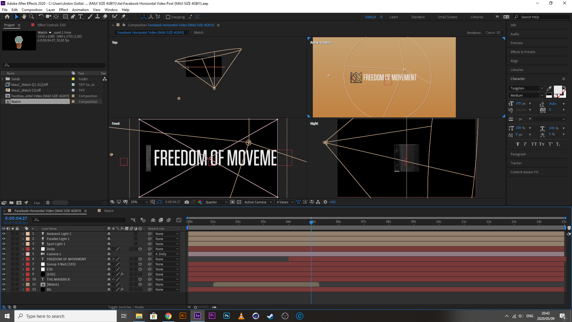
Setting up AFX structure across the Board
Every file in this project has similar parts to it. It needs one of the OBJs I created (along with the extruded logo), it needs some of the photos created by the Photography department, it needs one of the color schemes I created and there needs lights and a simulated floor for reflections.
I’ll start with the floor, it needs to be of a decent pixel count, and there has to be variation in texture, something like concrete should do.
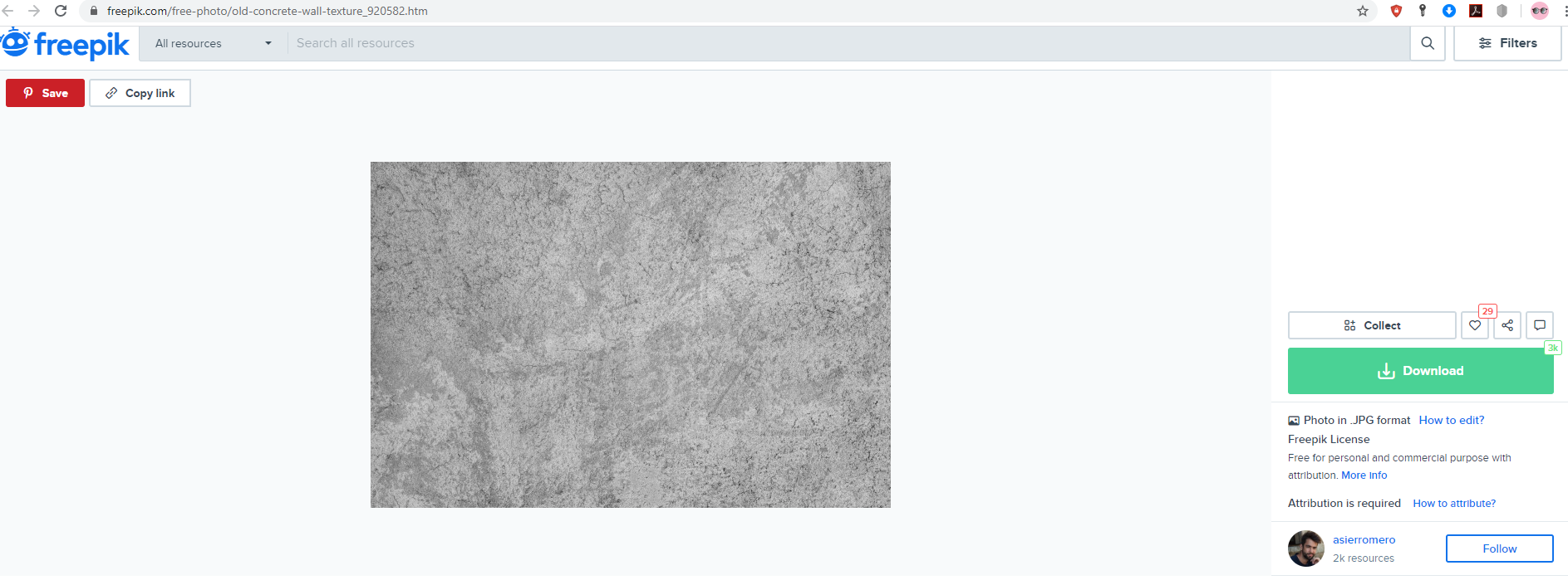
Because I’m a free user, I obviously have to give attribution to the person who created it,
Background photo created by asierromero – www.freepik.com
Normally, I would glance past the whole attribution thing, but what can I say, this website’s way of getting your attention to it, pulls on heart-strings, and I’m a sap for it.
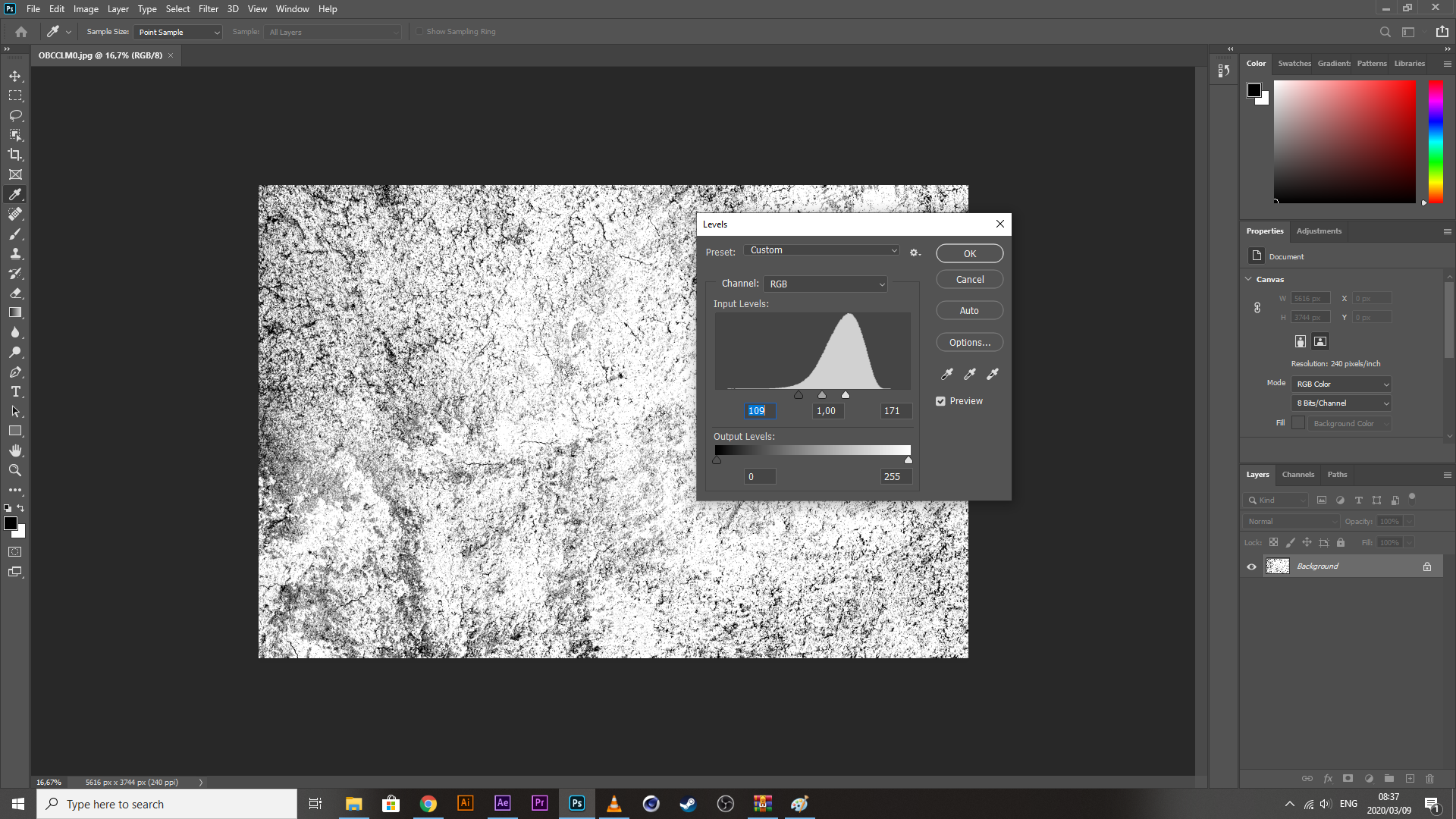
So, now that I have my texture, I need to threshold it to just degrees of blacks and whites. I generally do this with Photoshop using the Levels tool. Save it, and put it into a textures folder within the gfx section of my afx root locale.
09/03/2020 II
So I have been experimenting with the setup of my videos (essentially, they all will in the end, have the same content and be made of the same components), and I have come to a few realisations.
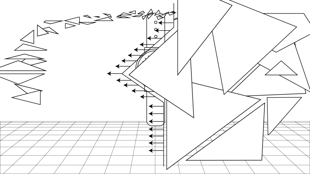
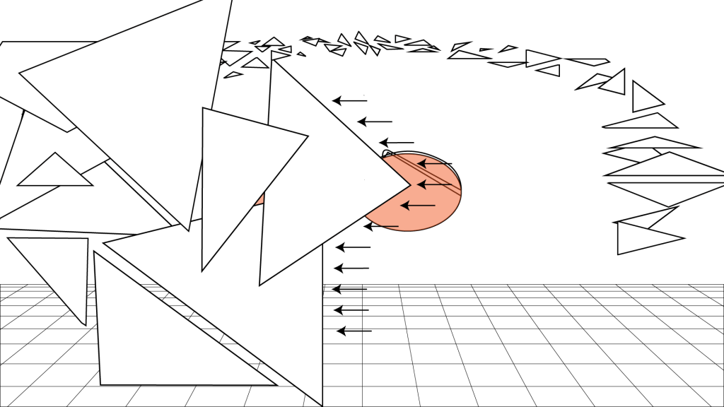
One: I don’t have as much control over the fractures that come from the obj. After a bit of tweaking and altering displacement values for every axis under the sun, and messing with the unified displacement units, there is no way to get them to move in a perfect orbit, which means my idea of debris suspending the view of the viewer while a mask wipes the product out of sight – is now off the table.
I do have a work a round for this: I can allow the reveal of the product happen as the object (suit) is fractured and I can give it a second or two, after which, I will reverse the dispersal of the fragments back to their original position, and in that reversal, I take a poly-point circular mask and bring in all the points until they overlap, resulting in the product being masked out of view.
09/03/2020 III
It has been a bit of a disappointing day. Quite a few things required that I go back to the drawing board. The image sequence wouldn’t allow me to move the files around in the timeline (eventually found a workaround with the files we were originally given, despite trying to convert them to solve the issue), the objects reflected light in a very odd way, the orbit idea didn’t work, I didn’t get to construct that imperfect reflective surface with that texture that I got and edited specifically for that purpose (just cause all this other shite was going wrong) etc, etc, etc. Never-the-less, I have completed a pretty-punchy 5-sec video despite so many setbacks and I may finally have my format for the rest of the videos, ensuring that this process goes a bit smoother.
I popped my file onto MM group to grab some constructive criticism, expecting to get a couple of roasts in there, but it was actually well-received, which is actually been a bit of a boost to my day. I’m not gonna lie, its been a rough couple of days, aside from being a bit sick, its been tough lately trying to find a reason and the energy to get up in the morning, and its difficult to try and take care of yourself when your responsibilities and your finances don’t align with your own well-being. I literally wanted to go and see a doctor 4 days ago, but my bank balance was so low that I had to decide what was more important, getting to the academy till the middle of the month, or get checked out by a physician to see if everything is still running like it should. What a crazy choice to have to make. Anyway, check out what I made, if you got any constructive criticism, throw me a message
