
Last stretch, ladies & gents. This is the second last brief of this year and of this degree. Terrified? You bet your *#% I am, but there’s no helping that now, so the way I am going about this is just plunging my head in first, come hell or high-water.
This brief is technically a revisit to our very first brief of the year (and arguably one of my roughest). If you’ve been in on the journey, you will know that we were in the process of designing and prototyping an app. An app has a purpose to serve with an intended audience and specific intended outcomes that result from the interaction. Our goal was to create something to fit that description. Naturally, we’re in 3rd year, so we were given quite a bit of free-reign to chose what we wanted our mockup-app to do.
A lot of us (myself included) were concerned with potentially solving serious issues like food distribution to those who are struggling to find it, helping less privileged designers find a foot in the industry, etc etc.
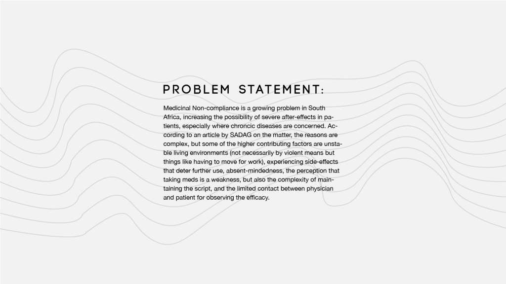
I was concerned with creating some means of making the process of renewing and maintaining a medicine script easier and less stressful. Why would this be an issue to anyone? Isn’t the process relatively straight-forward already? Perhaps to people who are in complete control of their lives. To my knowledge, very few people find themselves to be in this position. Anyway, I’m getting ahead of myself here…
What is this brief all about, if it’s technically a revisit?
Creating an explainer video. You see, we’ve done the research to motivate why such an app is needed in the world. We’ve done the designs, and prototyping, but none of it means anything if you can’t create a hook for people to engage with it. An explainer video is just that, the hook for the app.
This brief is all about creating an explainer video that breaks down the need that the app fills, who it’s for, how it works, and where one could get it. All of this could be done in a boring-as-all-hell presentation but you’d lose the emotional connection between the audience and the app you’re trying to get them sold on. We are emotional beings, and sometimes, it’s important to recognise it and address it.
So what are specs?
2 minute case study video
What to cover:
– the reason why the app was created
– the most prominent features
– the tie up at the end needs to tell the user where they can find it (app store)
Write a script + storyboard:
– break the story down and structure the way the “story” will be told
– start video with something catchy/engaging (a phrase or interesting visual) to lure the viewer into the video and into the product
– the why is one of the most crucial aspects to selling the idea
– maybe tell a story about the “user”, not the only way but its one of the most prominent methods
Find the narrative that DRIVES your idea… and then make a story around that.
It’s all about HUMAN CONNECTION. Also, when the viewer listens, they need to know what the problem is and how it has been overcome.
So how the hell do I intend on going about all of this?
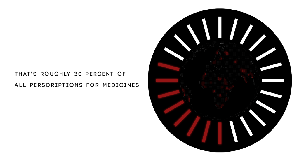
I’m ahead of the game, I knew this brief was on the horizon, so I took a day over weekend to go over everything, but most specifically my motivations. The initial pitch was personally-orientated and a bit anecdotal, so it could be argued that it isn’t something that could motivate a large portion of the audience to get the app, but what was a massive motivator (at least, in my opinion) were the stats concerning the problem.
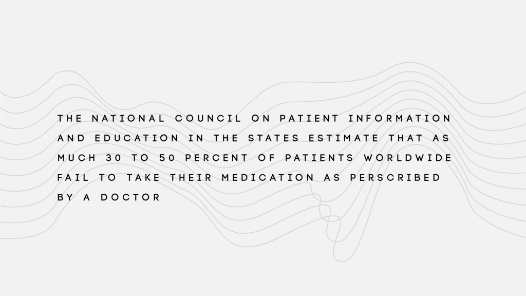
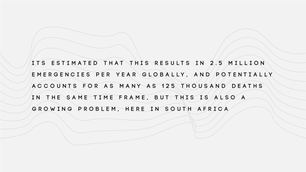
Initially, I wanted to prototype this idea because it was a highly personal issue (I couldn’t continue my treatment due to moving and a bunch of other circumstances that were out of my control), but when I got to the stats, it just opened up how huge this problem could possibly be. To give an example, here in South Africa, we have a problem with TB becoming more and more resistant to drug treatments because people start to feel better, and then decide that they no longer need the treatment, resulting in their health falling into remission but the drugs no longer effectively attack the bacteria that causes it, making continued treatment with that set of drugs no longer a viable option.
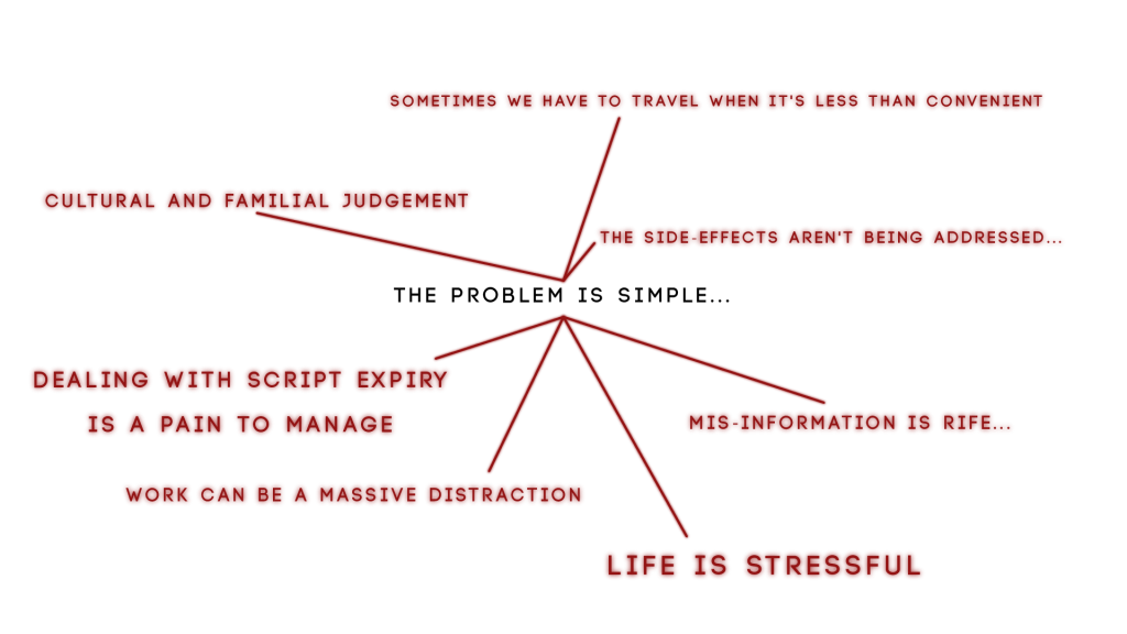
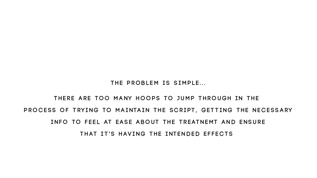
This can have a massive impact on a community because anyone who catches the disease from a person who hasn’t properly gone through the treatment procedure will receive a drug-resistant form of the disease, meaning that they have to be put on another cocktail of drugs to combat the version they have, it doesn’t take long for something like this to turn into an epidemic. But of course, it isn’t just limited to people who are experiencing diseases that have a huge physical tole on the body, but also ones which effect mental and social fortitude as well. Combating the stigmas surrounding medicinal treatment for mental illnesses has been a serious issue here for a long time, as a result of push-factors such as misinformation by the patient or their family concerning the condition and the treatment plan, cultural aversion, assumptions of perceived weakness for even having to go on a treatment plan in the first place, but there are also pull factors away from a potentially successful treatment plan such as a high-stress living environment or life style (one which just isn’t conducive to taking the time to properly care for yourself and ensure that a schedule of some kind is setup for that purpose), work (and especially where work demands that you travel extensively), experiencing first-hand the side effects of a treatment plan that has yet to be properly tailored to you (and not having the time or a platform that allows you to discuss it seriously with your practitioner), the list goes on and on.
Of course, I broke down the issue as well and put it as plainly as I possibly could have at the time.
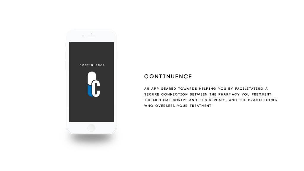
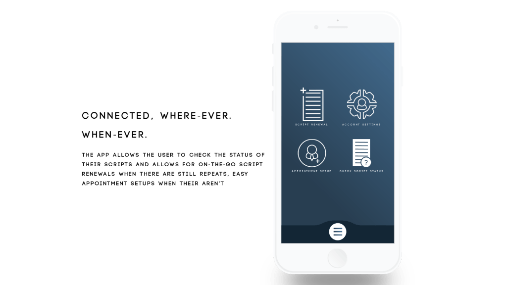
On an individual scale, the app’s goal is to facilitate a connection between the person trying to keep their script up to date, the pharmacy trying to maintain it, and the doctor prescribing it, ensuring that they patient has the info they need, whether its about the drugs themselves or the status of the script, to continue their treatment plan. On a larger scale, it’s attempting to diminish medicinal non-compliance as best as possible.
I named the application…
Now, lets talk about storyboard, I’ll explain a bit later, currently anticipating load-shedding to hit at any moment. I will elaborate as soon as the power comes back, but for now, here are the images.


Okay, rather than doing a mass annotation of the storyboard, I’m just gonna drop the script here, otherwise I’m gonna be here all day. Every camera directive and shift is contained within, along with the VO and where I want their parts to go
04/09/2020
So a couple of changes have been suggested, stick with the color scheme of the app as opposed to the use of foreign colors, and be a bit more dynamic with the individual sections of the app preview. I’ve run into a couple of technical difficulties in terms of a possible route of execution with the second part, namely as a consequence of how Element 3D works in After Effects. 3D models don’t actually exist in a 3D space in After Effects, its actually a flat comp that exists in its own faux-3D world space, to which, you can only effect the 3D model via the Element 3D workspace meaning that nothing in the After Effects workflow can effect whats happening in that space and vice-versa, meaning that I can’t scale or move things off of the 3D model because it is bound to that space. So I have 2 options, ditch the 3D mock-up or try and do some cleaver cuts, glitches, and moves to hide the fact that the stuff coming off the screen isn’t actually coming off the screen but fast-fading in and out where necessary. I’m gonna try my hand at the 2nd option and have reworked my script accordingly. Should it fail, I am just gonna have to make a 2D outline of a phone and work with that as best as possible.
But anyway, here’s the script:
04/09/2020 II
So the power’s back but I am in no condition to work right now. What started as a slight stuffy nose from allergies, has advanced into a full-blown sinusitis headache and I got nothing to kill it at the moment. So far, all I’ve been able to do is pick apart some of the screens that correspond to the highlighted functions of the app in the script and put them on separate boards for easy access in after effects.
I’ve also been looking at some tutorials may potentially help with my aesthetic execution of this project, like how to make a futuristic looking earth hologram in two separate plugins, trapcode form (which I have some experience working in) and stardust (which I have virtually no experience working in but may be a bit of fun).
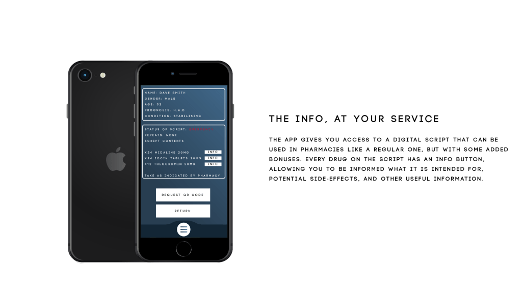
It appears very technical but I think it would be a big plus if I could pull it off, the reason being that my project earlier in the year became (although not intentionally) very data orientated, from its hook (the reason why its needed in the world) to what the app is supposed to do (provide info to the patient concerning his script, allowing him to make use of that data to make his life easier i.e setting appointments well in advance, easily shifting the script to be accessible from elsewhere and find out what exactly his meds are supposed to be doing) and nothing sells data-driven than that of holograms.
I’m gonna try my hand at the trapcode one tomorrow
05/09/2020
So I decided to put style testing and technical design on pause for a sec cause it just occurred to me that the screen size may be accurate to the screen size of an actual phone, but that doesn’t mean that it’s going to fit perfectly in that of a mockup file that wasn’t necessarily designed to be a 1:1 ratio, and I am so thankful that I did it this way cause I just brought a test screen into the model in Element 3D, and this was the result.
The UV position and scale required some messing with to get it to the point where I am happy with how the text and buttons are scaled in proportion to the mockup screen size (settings in the image below).

But if you take a closer look at where the notch of the phone is where the camera would be, you can see that bit of darker blue which is where the UV is repeating, which looks very unprofessional, and I would have this issue with every single one using this comp size and UV settings, not to mention that some of the icons would definitely start clipping the top of the phone, so what I need to do is make a template that takes this into consideration (bring up the height of the comp in illustrator so that I don’t have to remember the specs for every time I need to make a feature mockup), gonna finish that today, then I can worry about style testing and the like.
10/09/2020
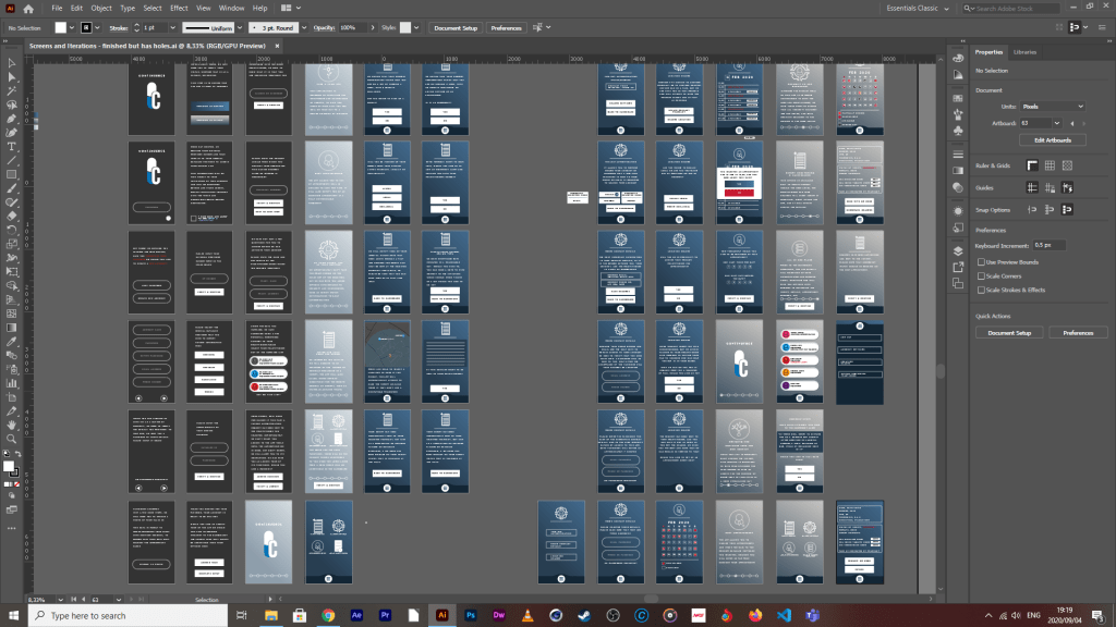
What is up ladies & gents, so the better scaled template is done, I finished placing every screen into that template, and have re-organised each individual element that I want animated into separate layers in illustrator (and again in AFX through precomping). If you were with us during the first event, you’ll know that I did very few complex or arty animations in in:Vision. The reason being that the program allowed for only one particular format, and there were few guides on how to leverage that format for complex shifts, fades, transitions, multiple button ups, downs and holds on a single proto-typed screen with renders in that format, etc, but now, I am no longer working in In:Vision, but rather a program that I am far more familiar with (After Effects) and can leverage to the fullest extent.
The reason it took me so long to do the last step above, is that I needed to keep in mind that I have to recycle some elements to appear in multiple screens, meaning that I need them as functional, usable comps (and not renders cause you can’t change renders when you’re done rendering them) across multiple major comps for various functions, both inside and outside the mockup, but now that that’s done, I can start animating those various pieces and can then stitch them together.
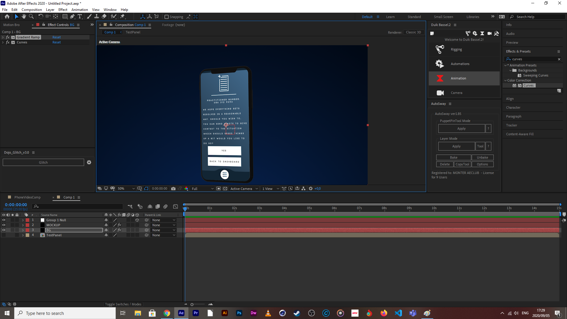
If you take a glace at the above screen capture, you can see that there’s a metric F-ton of layers that need to be modified to produce an animation, and this isn’t even the worst one.
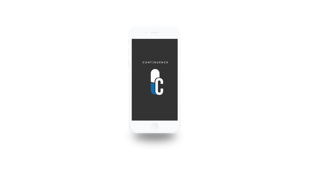
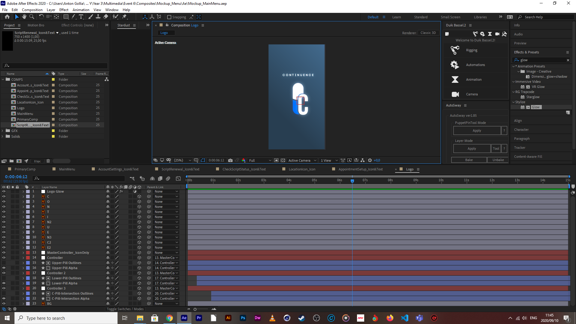
The Continuance logo (yeah, I see the spelling mistatke, afx doesn’t auto correct language but don’t worry, I will fix it) is gonna be front and center in the mockup both at the start and end of the preview of the apps intended function, so I decided to start here for the mockup animations.
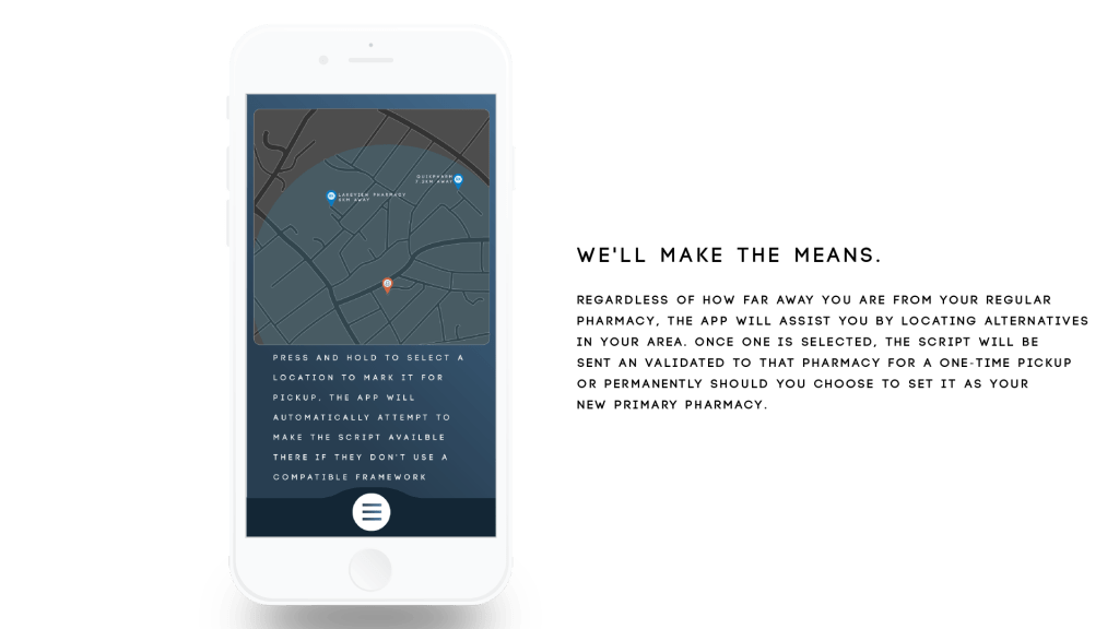
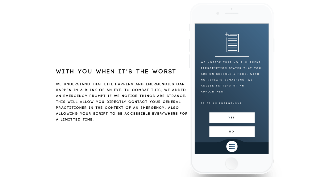
Next up are the main menu page items and the main menu animation in its entirety because the breakdown of all of the apps upfront functions are explained on a mockup of this screen but also because they contain two of the icons I know are going to be recycled in the emergency response page and an overlay of the location function for pharmacy selection happens straight after the function breakdown.

The location function and emergency sections are the most intensive ones to animate (also because I have to animate them twice because they are both in and out of the mockup space), so that’s gonna take some time but I do intend to be finish with them both by the end of friday, so that it’s just stitch in mockup and render on Saturday. Oh, and the introductory part is coming along nicely.
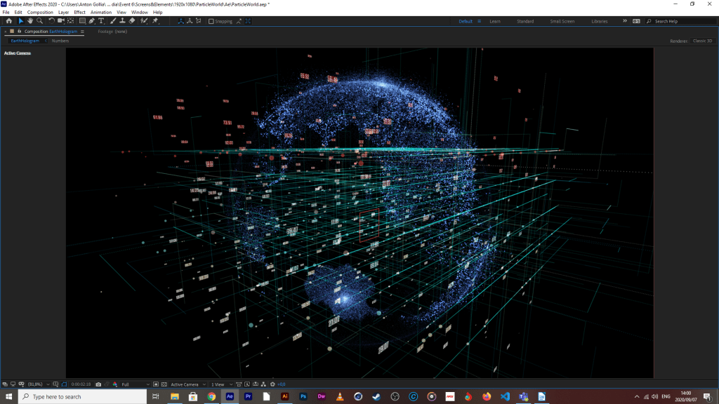
Stardust proved to be easiest, they had an Earth mockup preset that I could use and modify to my hearts content, I didn’t need to create a 3d model or any of that, which has saved me some time.
14/09/2020

Map section’s done, was going to do animated building outlines because the map seemed kinda bare but things were just taking too long and ultimately, it’s a mockup so I scraped that idea. I could still bring in a confirmation screen but I’ll leave that till later, it’s purpose would be to primarily extend screen time, but I don’t think that is necessary.

With the emergency section, I split the animation into two parts, the patients side with a simulated emergency that needs immediate attention.

And the doctor/practitioner side who is responding to the crises. The reason they had to be split is because there needs to come in a second mockup phone to illustrate that the response is happening in quasi-real time.

And then finally, the script and med info screen. Was gonna do a whole simulated slider for more info but that just seemed a bit unnecessary for the time being, the info on there already breaks down what the meds do and reassures the patient on the prescription that the effects are temporary and will pass with time . I might do highlighted text for parts which re-assure the patient of the reasons why they are on that specific medication, but that will happen during the final stitching of the animation.
I wanted to get the voice over done yesterday, but I had pretty serious allergic reaction to something over the weekend, my throat was partially closed, and with what little air came through, it made my voice sound like I’ve been chain smoking for 40 years straight, and I don’t even smoke. So today, I’m spending my time on a tune-up to the earth model, correcting colors and making the zones of non-conformance a bit more evident as it looks like the world is just one big non-conformance area (which is technically true, it’s impossible to express a dynamic representation without seeing that the data would point everywhere with little to no evident correlations). Lastly, today is about bringing in every individual project file into the same master project so that they can be co-animated into one major comp for export. Timing will be done as soon as I can do the VO without sounding like Robert DiNero after a pack of Camel smokes (not that I think he smokes, but just imagine how gruff that Italian American accent would be).
14/09/2020 II
So I said that I wanted certain areas to glow more than their adjacent counterparts. Unfortunately there is no way to select individual sections on the map in Ae and edit/highlight them as they are, but seeing as I’m not using a 3D solid shape to get that spherical deform and the particles are just points projected into 3D space.
So I’m about to do what’s considered as a pro-gamer move
All I need to do is make a duplicate of this earth hologram system and use a map that already has the highlights I want. Obviously I would need to use the exact map used to make the first one as reference. Otherwise, entire continents may be out of place, or I place a zone of non-conformity in the middle of an ocean, which wouldn’t make much sense. Luckily, Afx has this helpful function called “find in explorer” via a drop-down menu via a right click on the file I want to find. I made a duplicate of it and created a directory for it where I knew I could find it again, and then brought that copy into photoshop to manipulate it.

This one above is the copy before any modifications at all. And the one below this sentence is the modified one.

And down below is the result, it isn’t nearly as sharp as the final render will be.

What I think I need to do is create one more modified map for the first system, the reason being that there are some light areas where there shouldn’t be which could be attributed to the light areas that weren’t edited out, which is a bit of an oversight by me, but it can easily be remedied. Another option is to give the edited map some vertical turbulence so that they project off of the map, while giving the first map a different projection of a lighter or darker blue which should enhance the contrast between zones.
15/09/2020
This is the result of the above-mentioned changes.

Now, just for the final grid animate-in and background color changes, and we’ll be good for the next step

The Percentile Counter is done as well, but it’s a bit resource-intensive to gif it so it will have to wait until tomorrow to show it off. I liked the look of the hologram Earth so much that I just had to do the Percentile Counter in the same style. Unfortunately I couldn’t simply replace the earth model for the counter and set the projection settings from SPHERE to PLAIN, it just wouldn’t show anything, so I had to try my luck with Trapcode Form. It took some time and some sneaky alpha matting to work, but I finally have something I am happy with, which I think will tie in nicely once its all stitched. Currently working on the checkbox matrix, should be done with that tonight, and that will be all elements done and dusted, then it’s just final stitch, fine-tuning and sfx.
16/09/2020

Here’s the render of the percentile counter (minus the actual percentage display), I might turn down the fractal distortion a tad but otherwise, I think its gonna look awesome with some camera travel and depth of field during the breakdown. I don’t know why, but I keep thinking of Mike Shinoda’s song, fine, when I look at this, makes me wish I had the time to write and mix a track in that style, if you wanted to know what I was on during this process, it was this.
There’s a pretty sick music video to it as well but I won’t link it in here, but you should definitely check it out if you’re enjoying this, it’s absolutely sick.
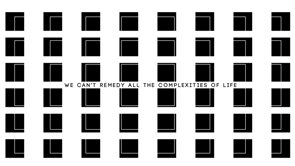
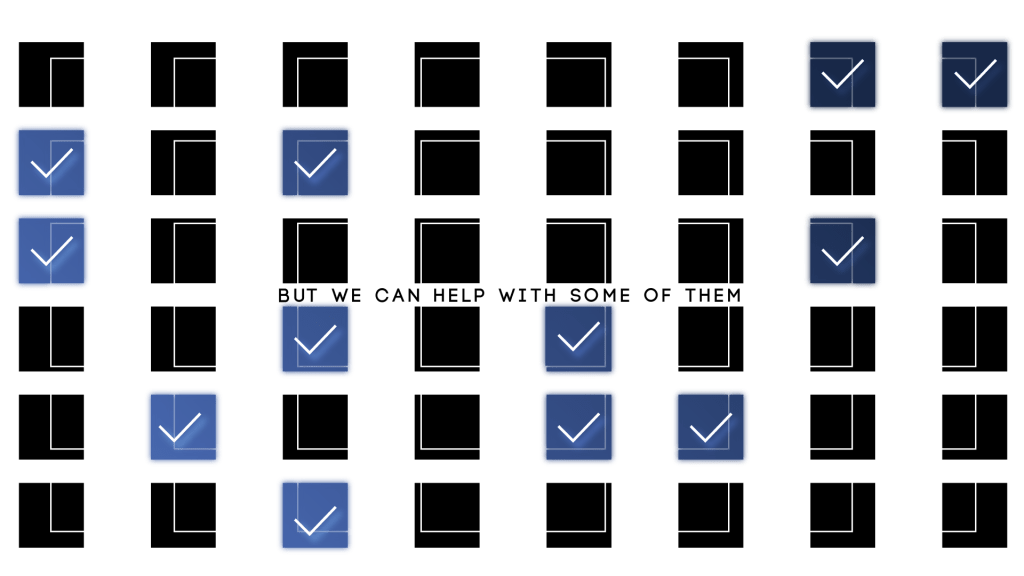
Also the checkbox matrix is done as well. I used a 500×500 sized ai file of one of the boxes, created outlines of them all, brought it into After Effects, created a precomp with just that one box, converted all layers into shapes, trim-pathed everything and modified their end values from 0% to 100%. I did this for all parts except for the actual check. I then duplicated that pre-comp, and brought it into your standard 1920 x 1080 sized comp, and made copies of them across the screen, as evenly spaced out as I could. I then made a duplicate of this comp, renamed it, and switched out some of the checkboxes with duplicates of the second precomp I made from the original file, so that some could be checked and others not. I did originally have fills in the ones that were meant to be checked, but I removed them because I couldn’t get the gradiented colors to blend the way I wanted to, they also didn’t sit well in the outlines, so I tried animating the outlines off, but it still looked weird so I left them out.

Now, for final stitch and tuning
17/09/2020
It’s finally done, with virtually no time to spare. This brief escalated to a level of technical difficulty that I was not expecting at all. Having to come up with witty solutions to things that you would expect to just work, having to change up my workflow to accommodate so many pre-comps, experienced glitching (and I mean the non-intentional and definitely non-sexy variety), to which I still have no solutions, but I am putting that behind me because overall, I’m happy with the way it turned out.
Could have definitely used a pop-filter before recording the vocals, but we make due with what we got. I’m happy with most of the animations so far, it was just a really time intensive process to make everything flow within each other to a point I was happy with, and in the end, when there was little time on the line for minute changes, that’s when you start to see little unusual offsets, but I think it adds a bit of character, especially taking into consideration of the type of person who could’ve used an app like this ages ago.

Anton – looking good – keep it up. Especially the app screen animations! That’s looking sharp!
LikeLiked by 1 person
Solid, will do, do you think the map needs any more artifacts, like buildings and street markers or do you think that may be a bit overkill?
LikeLike
Nope, map has enough – more will be overkill.
LikeLike